I make a fair bit of use of the Graphene theme, which has two features I frequently want: a non-scrolling menu and sidebar widget areas.
Like most themes, it’s not possible to customize literally everything about how Graphene renders a site. This is my compendium of things I’ve wanted to do that I had to find a workaround for. Most of them are custom CSS rules, entered in the “Advanced CSS” section of Customize.
There are a bunch of articles here also, which aren’t specific to Graphene, so if you don’t find how to do what you want, also browse the “how-to” category.
Table of Contents
Have widgets collapse upward on mobile
is a separate post.
Hide credit line
The free version doesn’t give you an option to get rid of the developer credit line, “Made with (heart) by Graphene Themes”. The following rule does this:
/* Hide the theme credit line */
#developer { display: none; }
Get rid of shadow outline
This theme includes a box around the page content If you want a really clean look, you may want to get rid of this box and just have all the background the same color. It’s possible to set all the background colors the same, but there’s no setting to get rid of the drop shadow border.

To get rid of the shadow, use the following custom CSS:
/* get rid of drop shadow around content */
.boxed-wrapper { box-shadow: none; }
Search field appearance
If you display the search field on the “nav bar”, Graphene isn’t smart about choose text and border colors that will show up against the nav bar background. Use the following rule to control the text color and give the field a visible outline. Substitute your color choices for the ones I use here.
/* search field on menu bar */
.navbar-form .live-search-input input {
    border: 1px solid #cccccc !important;
    color: white;
}
Upgraded menu
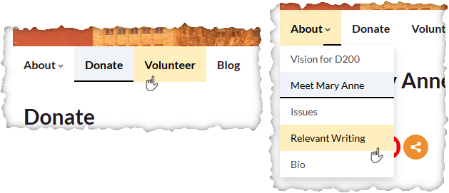
Still going with the idea of a cleaner appearance with fewer lines, I wanted a menu with a less boxy appearance. I decided to use the same background color as the rest of the site, with a slight shading to show which was the current page, and also an underline to give the same information with higher contrast. Additionally, if the current page was associated with a submenu item, I wanted to have the top-level menu flagged somehow as well as the submenu item. A dark underline under just the menu dropdown indicates the current page corresponds to a lower-level menu item below that one (e.g. Meet Mary Anne is a second-level menu item under About, so when you’re on that page, the About menu item shows a partial underline.

The styling also gives a different background color when the mouse cursor is over a menu item (I chose a pale yellow).
/* give nav menu a simplified appearance. */
.nav {
	--navhover: #ffefbe;
	--activebg: #f0f3f8;
	--activeunderline: black;
	--underlineheight: 3px;
}
ul.nav > li.menu-item {
	border-right-width: 0px !important;
}
li.menu-item.active {
 	background-color: var(--activebg) !important;
	box-shadow: inset 0 calc(0px - var(--underlineheight)) var(--activeunderline);
}
ul.nav > li.menu-item:hover {
	background-color: var(--navhover) !important;
}
li.menu-item a {
	background-color: transparent !important;
}

/* settings for dropdown menu items */
.dropdown-menu li.menu-item:hover {
	background-color: var(--navhover) !important;
}
.dropdown-menu .menu-item.active {
	background-color: var(--activebg) !important;
}
/* .menu-item.active:after {
    content: " ";
    background: var(--activeunderline);
    position: absolute;
    left: 0;
    right: 0;
    bottom: 0;
    top: calc(100% - 3px);
} */
.menu-item.current-menu-ancestor {
	background-color: var(--activebg) !important;
}
ul.nav > .menu-item.current-menu-ancestor:after {
	content: " ";
    background: var(--activeunderline);
    position: absolute;
    left: calc(100% - 25px);
    right: 0;
    bottom: 0;
    top: calc(100% - var(--underlineheight));
}
/* end nav menu styling */
Near the top of the above code, I’ve pulled out four aspects into definitions on lines beginning “–” to let you easily customize the three colors — active background, hover background, “active” underline, and thickness of underline. Edit those to values you like.