Occasionally, in your WordPress website, you’ll want to highlight certain menu items by giving them a button-like appearance.

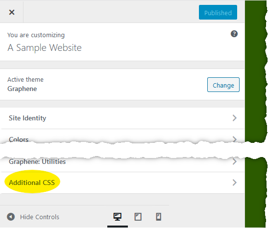
I don’t know of any plugin to help with this (though there are so many plugins, who knows, there might be one). I do it with CSS (Cascading Style Sheets). The technique I’m describing should work with any theme that has a way to enter your own CSS (if not, please let me know). My example uses Graphene theme, where this setting is in the Customize screen, at the end of the top level of navigation entries.

Add the following rules to whatever you have there now:
/* Several rules to make menu items look like oval buttons. You must use the class name oval-menu-button in the advanced menu properties in the dashboard to select which items this applies to. */
.oval-menu-button {
	--normal-text: black;
	--normal-background: gold;
	--hover-text: white;
	--hover-background: #999950;
	--active-text: white;
	--active-background: #808000;
	--font-size: 14px;
	--button-height: 35px;
	--raise-text: 5%;
	--shift-button-down: 7px;
	--space-before: 40px;
	--space-between: 7px;
	--corner-radius: 20px;
}
li.oval-menu-button {
  background-color: var(--normal-background);
  border-radius: var(--corner-radius);
  margin-left: var(--space-between) !important;
  margin-bottom: 0px !important;
  margin-top: 0px !important;
  height: var(--button-height) !important;
}
li.oval-menu-button a {
	display: block;
  font-size: var(--font-size) !important;
  color: var(--normal-text) !important;
	padding: 4px 10px 4px 10px !important;
	min-height: inherit !important;
	position:relative;
	top:50%;
	transform: translateY(calc(-50% - var(--raise-text)));
}
/* hover over oval menu buttons */
li.oval-menu-button a:hover {
  color: var(--hover-text) !important;
}
li.oval-menu-button:hover {
	background-color: var(--hover-background) !important;
}
/* when on the page corresponding to that oval menu button */
li.oval-menu-button.active a {
  background-color: transparent !important;
  color: var(--active-text) !important;
}
li.oval-menu-button.active {
	background-color: var(--active-background) !important;
}
@media (max-width: 767px) {
  /* applies to phones and tablets -- you may need to adjust this number based on when the menu gets hidden behind a "hamburger" button. */
  li.oval-menu-button {
		margin-left: 0 !important;
		margin-right: var(--space-between) !important;
		float:right;
    display: inline-block;
  }
}
@media (min-width: 767px) {
  /* applies to big screens -- adjust number to match above rule. */
  li.oval-menu-button {
		margin-left: var(--space-before) !important;
		margin-top: var(--shift-button-down) !important;
  }
}
li.oval-menu-button ~ li.oval-menu-button {
  /* spacing left of second and subsequent oval buttons */
  margin-left: var(--space-between) !important;
}
Next, switch to the “dashboard” of your site and navigate to Appearance > Menus to create the menu item you want to format as a button. To apply the button formatting, you’ll need a field that’s not visible in Customize — the CSS Classes field. It’s also not visible in the dashboard by default, but you can use the Screen Options control at the top of Menus screen to make it visible. (NOTE: once you do this, the CSS Classes field is also available in Customize.)

In the menu item whose appearance you want to change, set the CSS class to oval-menu-button.

The CSS you pasted in contains several parameters you can adjust to control the buttons’ appearance. These are all in a section at the top, and are all lines of the form “–name : value“.
If you find this website helpful, subscribe for email updates!
Your information will not be shared (except with MailChimp, who manages the subscriber list).
Adjust the “value” part of each line to get the buttons looking the way you want. The effects of these values are:
- normal-text and normal-background: The colors of the text and background of the button under normal circumstances.
- hover-text and hover-background: The colors of the text and background when the pointer moves over them.
- active-text and active-background: Colors if the text and button when we’re on the page corresponding to that button.
- font-size: Size of the text in the buttons. You can use “pt” or other units besides “px” if you like.
- button-height: How tall the button is.
- raise-text: Amount the text should be raised within the button to center it vertically, expressed as a percentage of the text height (you can use px if you prefer).
- shift-button-down: Distance to lower the button to line it up with other menu items.
- space-before: Size of a gap to the left of the first button.
- space-between: Gap between buttons.
- corner-radius: Curvature of button corners. If the value is larger than is needed to make the ends completely round, they will be completely round.
The Customize screen is great for adjusting these settings because you can change numbers and see the result in real time.

Most themes have a different appearance for the menus on phone and mobile, or generally if the screen is narrow. Test the buttons in that mode to make sure they adapt okay. This is also easy to do in Customize by clicking the responsiveness test icons at the bottom of the window.