Graphene is one of my favorite themes — I’ve used it on several websites. It has a nice look out of the box, a reasonable but not overwhelming number of options in the Customize panel, and acceptable text formatting, for free.
There are, however, a few things I frequently want to do that aren’t directly supported. To make those work, I have a few “Graphene tricks”. This is one of them.
This tip requires some CSS expertise to implement.
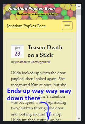
I like to lay out sites with a sidebar (left or right). Problem is, when you view the site in a narrow window — on a phone, for instance — the entire sidebar drops down below the main content of the page.

 As a result, important stuff I put at the top of the sidebar so people would see it on the first screen, like my email list signup form, gets pushed below the main content of the page on “mobile” devices. (Incidentally, please sign up for my email list to be notified when I post new useful web development tips. Like this one.)
What I’d often prefer is for some things from the sidebar to stay above the content, while other sidebar items can be put at the end or left out entirely on a narrow screen.
There’s no way to split up a single widget area and have some widgets go up and others down. You have to put your widgets into two different widget areas, one that appears above the content on narrow screens, one that appears below. Some themes have a “top sidebar” that moves up and a “bottom sidebar” that moves down on mobile, but Graphene isn’t one of those. Instead, use of other widget areas that already appear above or below the content, and duplicate some widgets. Then control widget visibility to make only one of the duplicates visible at a time.
Table of Contents
Visibility control

Visibility control is done using the “Display on” field of the widget’s settings. You can select that widgets be visible on “Desktop and mobile”, “Desktop only”, or “Mobile only”.
If you duplicate a widget, you would set one copy to “desktop only”, one to “mobile only”. You might want to take advantage of the fact that you have two copies, to vary their appearance. Often you want the small-screen version of a widget to use less space. In the above example, for instance, I don’t really want an email signup form at the top of every page on mobile, but something smaller. I could use a Subscribe button instead, that takes them to a separate page with the form on it. So I’d use the embedded form widget on desktop, and a link button on mobile.
Duplicating widgets
Some widgets have a lot of settings, and it’s a pain to copy them manually. To get around this, I recommend the Widget Clone plugin, which adds a “Clone” control at the end of the widget settings. Make your clones from the dashboard (Appearance > Widgets) rather than from Customize, because in the dashboard, you can drag your clones into a different widget area.
Choosing Your Widget Areas
Next, you have to figure which widget areas to put your desktop and mobile versions of widgets into. In Graphene, the left sidebar is optionally able to move up on mobile, so if you’re using the left sidebar anyway, you could take advantage of that. However, I’m not in favor of that because if you have many widgets, you end up duplicating a lot of them instead of just the one or two you should have on top — and if you want a more compact widget for mobile, as in my example, you end up duplicating that too.
I prefer to duplicate just the few widgets I want on top, and put them in a widget area above the main contents. There is actually such a widget area in Graphene — you just have to enable it. You’ll find the checkbox in Customize under Graphene: Advanced > Action Hooks Widget Areas > header.php, and there are actually two widget areas, called “” and “
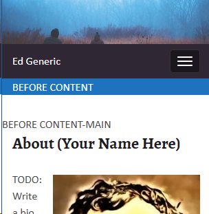
 The difference between them is illustrated on the right, where I’ve enabled both and put one text widget in each. The “Before content” widget area is above the div that contains the content, so it has the site background color (blue in thie case) rather than the content area background color (white). It also appears right below the menu bar. By comparison, the “Before content-main” widget area it right above the page title, so it has the white background and also some padding above it.
Use the one you prefer — I generally prefer “Before Content” because I like the widgets up near the menu and don’t care for the extra padding. In either case, these widget areas have no particular styling, so you’ll probably need the Additional CSS section of Customize to control their appearance.
Example
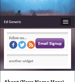
 Let’s consider the original example. I’ve enabled the Before Content widget area, and put two widgets into it — one is the “Sassy Social” Follow widget with a button I added on the right, to make best use of the vertical space, and the other is just a bit of text.
While space is valuable, these are a little too tight, and there’s not enough contrast with the background. I don’t want to change the desktop background just for this, so I’ll use CSS to give the widget area a background.
Using the browser’s developer tools, I look at the area I want to restyle. The widgets are all contained in a “div” with the ID “graphene-dynamic-widget-graphene_before_content”. Then there are two other “divs” inside that to contain the two widgets, and I’d like to space them out a little and make them look more like the other widgets. After a little experimentation, I came up with these rules and the resulting appearance:
@media (max-width: 768px) {
#graphene-dynamic-widget-graphene_before_content {
background: white; /* or whatever you like */
margin: 4px 0 8px 0;
padding: 1px 12px 12px 12px;
}
#graphene-dynamic-widget-graphene_before_content>div {
border-top: 8px solid rgb(219, 219, 219);
background-color: rgb(249, 249, 249);
margin-top: 12px;
padding: 8px;
}
}
 The “@media” line controls the rule so it only applies when the screen width is such as to correspond with a mobile device — otherwise you get a rectangle for the top widgets even if the screen is wide enough that the widgets themselves are hidden. Obviously, adjust the colors, padding and so on to your taste. I didn’t format the headings yet, but that would be more rules similar to the above, for “p” and “h3” elements or whatever.
NOTE: the web server can’t tell the screen width, so any decisions about visibility or positioning of elements based on the screen width are made after the browser receives the page. So the HTML for those widgets has to be included in the page whether or not they are to be displayed. Rules like the above make if possible for the display to adjust automatically if the screen width changes after the page is downloaded — if the user turns a tablet sideways and the page rotates, for instance.