WordPress supports two ways of editing pages and posts: the “Blocks” editor we’ve been using for pages and posts (sometimes called Gutenberg), and the “Classic” editor, such as you use to edit the blurb on book pages.
If you prefer the more word-processor-like Classic editor, you can use it on pages and posts also. You can activate this capability by installing the Classic plugin. However, the Classic editor is pretty basic. There are some old plugins to add capabilities to it, but developers aren’t really working on extending it anymore, and many of those tools have fallen out of maintenance. Blocks is the future.
There are lots of video tutorials on Blocks out there and it’s easy to find some that are up to date and are specific to whatever you’re doing, so I haven’t shown more than the basics here. And you don’t have to do more if you don’t feel like it. But if you’re willing to stretch a little, here’s an example of something a little fancier than you’ve done before.
The sample project is to create an enhanced book grid with covers, descriptive text, and buy buttons.
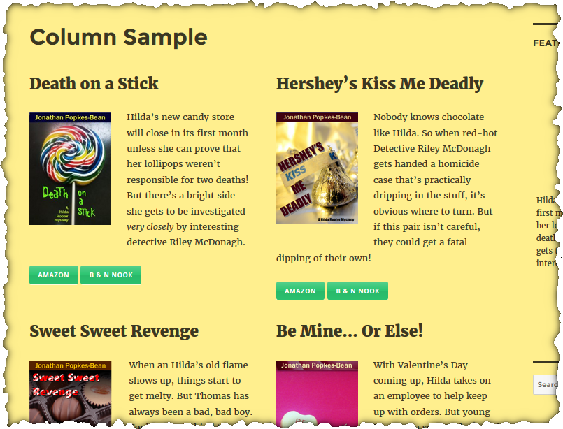
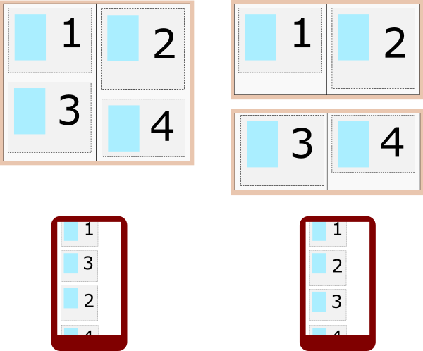
The columns will be responsive; if the screen is too narrow to display columns side by side (e.g., on a phone), the right column will drop below the left, giving a single column.
We don’t actually want columns here; we want something that acts like a table or grid. The rows should line up, and if they go into a single column because the screen is narrow, each box should be below the box that would be to its left on a larger screen.
So we won’t have just two columns, we’ll have a set of two equal-height columns with one book in each column, then another set of two columns below that, and so on. You can see this above where the title lines on the second row of books line up even though the heights of the contents of the first row are a little different.
To begin, use the New > Page control on the dark toolbar.
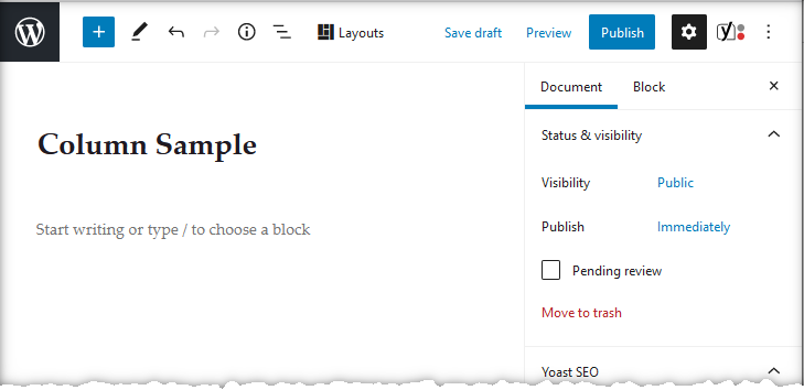
Set the title to “Column Sample” as shown, or whatever you like. Click the “Start writing” text, as you would if you were going to just put in text, but type “/col”.
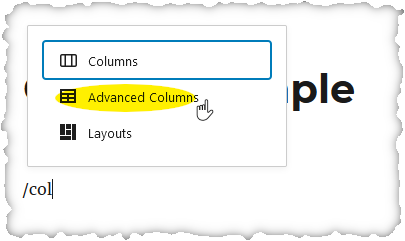
Select Advanced Columns (from the Genesis Blocks plugin, gives you more control than the regular Columns block).
Use the Outline icon at the top of the screen to show the structure of your page.
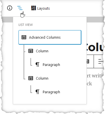
A Blocks page is structured with things inside of containers which may be inside other containers. In this case, you have an “Advanced Columns” block which contains two “Columns”, each of which then contains a “Paragraph”.
What we wanted was to have a heading with the book title, above a cover thumbnail left-aligned beside a blurb. Click the “Start typing” text in one of the columns and type “/” to select the block type. Choose Heading.
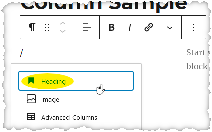
Type the book title. The default heading level is H2, which may be a bit large, so use the block properties on the right to adjust the size.
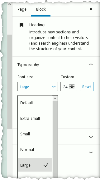
You may be tempted to adjust the heading level from the default H2 to, say, the smaller H4. Don’t do that. It’s an accessibility violation to skip heading levels. For more information see 12.1 –Accessibility.
Press Enter to start a new block. Next we want the cover image, so this will be an Image block. As you’ve done before, type “/” and find the image block, and add the cover image at the thumbnail size (using the “Image size” field on the right).
Or, you know, whatever size you want it.
Use the popup toolbar of the block to select left alignment.
Then press Enter, or use the “…” on the toolbar to “Insert after” to create a new paragraph block, and type your blurb. Then click in the second column and repeat the process for another book.
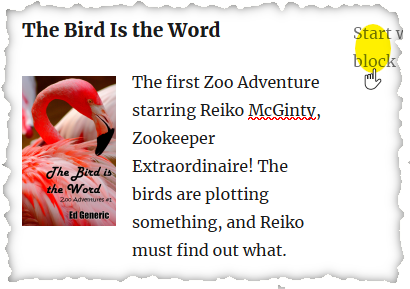
So that’s one row of two books complete. Now we want to add another row. But this isn’t a table, remember – it’s a series of column pairs, which are containers (the columns) inside a larger container (the Advanced Column block). We need another Advanced Column block, but it needs to be inserted at the right point – not inside of a column of the first row, for instance, but after the first Advanced Column block.
So we need to “Insert after”, but first we have to have the Advanced Column block be the currently selected thing, so it’s inserted after that.
The outline control we looked at earlier can be used to navigate the document. Or, look at the bottom left of the screen for the “breadcrumbs” showing where in the document you are. You can navigate with this also.

So if you click “Advanced Columns” there, you can see the popup toolbar for the whole Advanced Columns block, and use the “…” menu to Insert After.
(Alternatively, just press Down Arrow until you reach the bottom of the document and you’ll be in a new Paragraph block, where you can type “/” to change it to a different type.)
Now just type “/col”, select Advanced Columns again, and repeat the process as many times as you need to, to add all the books. If you have an odd number, I suggest you just add the last one below the last set of columns and let it use the full width.
You may recall I suggested using Advanced Columns rather than Columns because the former has more options. We can look at those now. Use the Outline button at the top of the screen to select the first Advanced Column block, and look at the Block settings tab on the right.
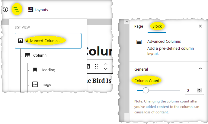
Besides setting the number of columns, as I’ve highlighted, you can scroll down and change other settings, such as the spacing between columns, background color of the whole set of columns, and margins and padding.
By navigating to each column, you can also set attributes of that column, again including background, margin and padding.
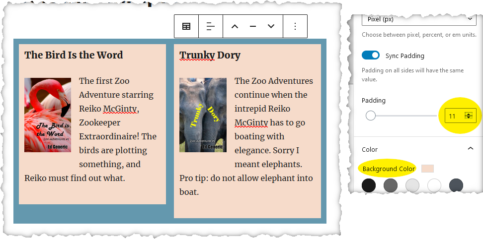
The above shows the background color of the column is beige, and padding has been set to 11 pixels all around, which prevents the title and picture from being flush with the edge of the background rectangle. The Advanced Column block also has a background, blueish, and padding so you can see the background color around the sides of the columns it contains (but those settings aren’t shown above).
Unlike a word processing document, in web design “margin” refers to spacing on the outside of an object, while “padding” is the inside spacing between the edge of the container and its contents. It can be hard to see the difference unless there’s a border or colored background to show where the edge of the container is.
Preview the page, since things often look different in the editor.
This is, of course, just one simple example. Again, look for tutorials online or experiment on your own – or keep it simple and use what you know!