Words are your business, but the Internet loves images. Readers will like and share your blog posts more if there’s some image in them that highlights your subject in a humorous or interesting way.
This chapter is about finding, modifying, and creating those images.
Table of Contents
Where to Get Graphics
Be mindful of copyright when finding images and other media. Anything created by someone else, make sure you have the right to use before you put it on your site. As a producer of copyrighted content yourself, you don’t want your own work pirated, so it behooves you to respect others’ rights to their creations. Also, lawyers are expensive.
Images get around to such an extent, often after being modified multiple times, that it can be hard to know who owns the rights to them.
A web search for “sources of free images” will come up with lots of good resources. A Google image search using the Tools section to search by image rights is also a good source, but take care; the details of the license are important, and Google isn’t always correct about the rights, especially if you grabbed a related image instead of one in the main search results.
Unless something is in the public domain, there is a copyright of some sort and your use is allowed in specific ways only. Get familiar with Creative Commons licenses and pay attention to the differences between free to use, free with attribution, and other options.
Putting the images on the website of your writing business is a commercial use. If you modify them, “reuse with modification” is a specific right that might not be allowed.
Have a tracking system. Keep a copy of the original images you download, and track where you got the images you use—start a spreadsheet with the date downloaded and URL of where you found the image, and notes—so that if there’s ever any question, you can show that you at least made a good-faith effort to ensure that you had the right to make use of it. If in doubt, ask permission, and keep a record of the permission.
Image Size
Image size can be confusing because it can mean three different things that are somewhat related. This discussion is about online images; there are different considerations when designing for print.
- The file size of an image is measured in bytes; it’s the amount of space your image file takes up on disk. This is important for performance. When your image appears on a web page, the server has to send it to the user’s computer. A huge file takes a long time and slows your website.
- The dimensions of an image generally refer to its size in pixels – the square colored dots of which it’s composed. Since it takes a certain amount of memory to store the color of each dot, the file size is in rough ratio to the product of the dimensions. For example, if you scale an image down 50 percent, you reduce the file size around 75 percent. An image 200×100 pixels contains 20,000 pixels. Reduce it to 100×50 and it’s 5,000 pixels – a quarter the size. So there’s a tradeoff of file size and image dimensions. You want images to contain enough pixels to look sharp at the maximum size you intend to display them, but not so many as to impair performance.
- Image dimensions may also be given in inches, centimeters, or other length measurements. This measurement doesn’t affect how your image appears online. It’s helpful when designing for print, but on your website, only the size in pixels matters to control the size the image appears on screen.
To state it simply: when creating images for the web, use pixels as your unit of measurement. Inches/centimeters don’t matter.
But how many pixels large should the image be to make it appear the size you want on screen?
This is outside of your precise control. Computer monitors vary in their display resolution, from around 100 pixels per inch for lower-end monitors to around 150 for fancier ones. Web browsers will often display your image at 100 percent scaling, mapping one pixel of your image to one pixel on screen. So your 300×300 graphic will appear as a 3-inch square on some monitors, a 2-inch square on others, or maybe 1-inch square on a phone screen.
Visitors also might zoom in or out. You aren’t in control here. You can only try to size things appropriately and consistently for a default zoom factor and an average screen.
It helps to know the approximate display resolution of your own monitor. The computer I’m using now is 1,366×768 pixels – a common lower-end resolution. The screen is physically 7.6 inches high—divide by 768 pixels, and my screen is about 100 ppi (pixels per inch). Screen pixels are always square, so you can assume the horizontal ppi is the same.
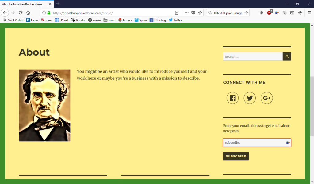
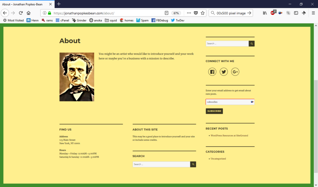
When I’m preview a webpage I’m designing, I could zoom out by three increments to see how it would look on a fancier monitor. Here’s one of Jonathan’s pages at default zoom on my computer, then zoomed out to simulate a higher-end monitor. It won’t be as sharp as it would be on a better screen, but I can see the layout.
Or if you have a high-resolution monitor, zoom in instead to simulate the experience of those poor souls with crappy monitors. You don’t need to do this every time you add an image; just once to get an idea what size image works best with your site design.
Don’t forget to also use the browser developer function to simulate various types of mobile devices also.
WordPress Automatic Scaling
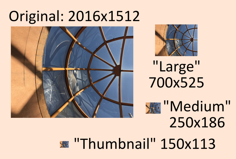
Once you have an idea what size images work best on your site, make those the standard sizes under Settings > Media in your dashboard. When you upload an image to WordPress, it automatically creates three additional, differently scaled versions of those images, in the sizes given by these settings (provided those sizes are smaller than the original). Depending on your theme and plugins, scaled images of several other sizes might also be created.
The aspect ratio of the scaled images remains the same, so these numbers are all maximum widths and heights. The idea is to have an assortment of sizes for different uses, so there’s always one big enough to look good, but for cases where it’s displayed smaller, smaller files are available for better performance.

I like Medium dimensions of 350 width, 400 height, which isn’t big on a lot of screens, but also works well on phones.
You’ll also want a “large” size suitable for cases where you want to display an image with no text alongside, and that’ll depend on the width your theme uses for the content area of the page. The image won’t appear larger than the available space, so a too-large image will still look OK, but try to get the smallest file size you can get and still look good.
It might seem wasteful to have all these copies of images at different sizes when you’re maybe only going to use a particular image in one size, but you aren’t. I mean, you aren’t going to use it only in one size. The server and the visitor’s computer are conspiring behind your back – the web page contains information about which sizes of an image are available, and the browser looks at the screen space available to display it and asks the server to send the one that fits best. This gives the optimal image quality and performance.
The Fuzz Factor
If you ever watch police or spy shows, you’re bound to eventually see someone zoom in on some tiny part of a surveillance video and magically enhance it to reveal a sharp image of the license number of the fleeing vehicle, or the writing on their parking permit, or the number of stitches in the handle of their purse, or whatever.

That’s a fantasy. Once something is fuzzy, you can’t un-fuzz it. There are programs to sharpen the edges a little, but the information just isn’t there to recover a sharp image from a few pixels. When scaling images, if you scale the picture down in your graphics editor (PhotoShop, GIMP or whatever), then decide it’s too small and scale it back up, you don’t get back the detail that was lost in scaling it down. So:
- Keep a copy of the original image with its full resolution.
- When editing an image, to try it at different scales, use “undo” to get back to the original size. Don’t just stretch it to different sizes. You lose quality every time you do this.
Note: The GIMP program has a nice “Unified Transform” tool that lets you try every sort of transformation on an image and preview the result, and you lose no details until you finalize the transform.
Vector and Raster
Photographs and other images composed of a grid of colored dots are called “raster” or bitmap graphics. This includes GIF, JPEG, and PNG files, among others.
Another type of graphic is the “vector” image—SVG or WMF files. These images are generally simpler—line drawings and clip art. They aren’t made of dots; instead, they contain a description of an image made of lines, rectangles, circles, text, etcetera, giving their positions, sizes, colors, and line widths. It’s as if you told someone how to draw the image (translated to computer-language).
A vector image always appears sharp no matter how you scale it. You can resize parts of the image, shift a curve, and so on, without blurring them. They may also be smaller files, and therefore faster loading, than large bitmaps.
The vector image can also contain imported photos, which you can resize without losing resolution, but not edit otherwise. This is nice for making “memes” and other types of annotated bitmaps.
You can use SVG files directly as images on your WordPress site, with a little work. If you’re interested, there’s information on my website at https://torknado.com/2021/01/svg-file-in-a-web-page.
More commonly, you would use a vector editor to make a drawing, then export it to a bitmap format for use on your site. Keep the original vector file around in case you need to edit it or produce a new size of the bitmap.
Incidentally: vector tools will measure things in inches or centimeters rather than pixels, and that is fine. You’ll choose the pixels-per-inch ratio when you export a bitmap—and you may want to export multiple versions at different sizes, hence with different ratios. As always, what matters for a bitmap is its measurement in pixels – not inches.
Best Editors
In keeping with the idea of keeping costs down, I recommend these free tools for editing images:
- GIMP is good for photo editing.
- Inkscape is good for line drawings, fancy text, and “memes” stored as SVG vector files.
- WordPress itself has the ability to scale and crop images after uploading, which is often less trouble than editing them in a program.
Since these are free and open source, they may not be as easy to use as similar paid tools like Photoshop. The help files for GIMP are poor, but Google search is your friend—there are hundreds of tutorials for how to achieve specific effects. GIMP’s default file format can’t be used directly on a webpage; you must export your artwork to a PNG, GIF, or JPEG file.
In Inkscape it’s easy to draw shapes, and you can easily resize and reshape without worrying about losing resolution. That’s because your art is stored in a vector format, as described above. It also can incorporate photos and other bitmap art. This is how I created some images in this book—screenshots, which are imported or pasted bitmaps, and arrows, highlights, and text, which are vector annotations.
To use the SVG graphic on the web as a bitmap, export it to a raster file format, preferably PNG or GIF, specifying the pixel dimensions you want to scale it to.
Should I Use a PNG, GIF, or JPG File?
Each is appropriate, depending on the image. Generally, use the smallest file does what you need with the required image quality.
JPEG is generally best for photographs. When used for logos and other things that contain large areas of flat color, you can often see a little halo near edges of objects. JPEG doesn’t allow transparency.
GIF is often best for clipart and logo-like images. It’s your only choice if you need animation. It’s the most compact format if there are just a few colors in the image. It’s capable of transparency, but each pixel is either opaque or completely transparent — 50% opaque isn’t an option. The result is, your non-rectangular GIF only looks good against certain backgrounds. Those partially transparent pixels are needed to blend the edge with the background.
PNG, allows partial transparency, which makes it a good choice for logos and shapes that may appear against any kind of background. Use anti-aliasing in the image editor to take advantage of this ability. It’s also good for graphics that combine photo and flat-color elements.
Either of these circles looks fine against a dark background, but the PNG can have partially transparent pixels that let the edge blend with any background without looking stair-steppy. (incidentally, I am doing an animation with a PNG here, which I just said wasn’t possible, but this is a CSS trick to move the image around on the screen, not the image itself changing).


