My current favorite for flexible website building is the Neve theme by Themeisle. I believe their Hestia theme has basically the same set of options but with a different overall look (I haven’t tried it).
Table of Contents
Things I like about Neve
Clean look
This theme has a minimalist, uncluttered look. There aren’t borders and shading everywhere, and generally good use of whitespace.
Excellent SEO
Most WordPress themes are pretty good about tagging and arranging things the way search engines like, to get better rankings in search results. Neve seems to be better than average in this regard (but you still should use Yoast).
Typography control
There’s a long list of supported fonts built into Neve (if you’re a font nerd: all the Google fonts plus Typekit). Customize lets you choose the default Body font for the site. You can also choose the base font size and other characteristics.
This is beautiful, because one of the big problems with a lot of themes is they choose one font and size for you and that’s the one you’ll use. You can add more with plugins and custom CSS rules, but it’s often hard to apply the font consistently. This theme makes that simple.
There are also settings to control font, size, etcetera of each level of heading (H1, H2…). By default the base font applies to all of these, but there are settings to override that.
Choice of layouts per page type
Globally, you can choose to use the full screen width for the middle “stripe” of your page — the part between header and footer — or make it “contained” with a specified maximum width (because text lines that are too wide impair readability).
If you use a “contained” format, you can also choose whether to have a left or a right sidebar, or none.
You can make different choices for the default formatting of pages, posts, and “archives” (lists or grids of posts).
You can exempt individual pages or posts, overriding the layout for that one page. Use this ability with restraint, as there’s value in a coherent look to the site, with elements in a predictable place. But the front page, often, should be laid out differently from the rest of the site — it often makes sense to make it full width and pack things in side by side in responsive columns. There are occasional other exceptions, for instance a month calendar might need all the available width.
Flexible header
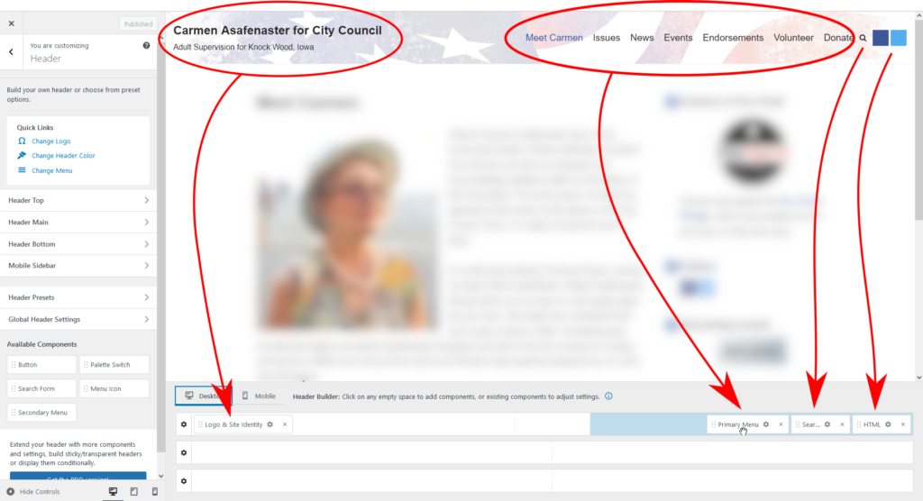
The site header is organized into three rows. You don’t have to use all of them. There are various bits of content — components — you can drag into the header. The site title and tagline, the main menu, a secondary menu, a “hamburger” menu button, search button, link button… Again, you don’t have to use them all.

In the above example, I’m setting the header’s appearance for desktop systems. I’ve only added components to the first row, Header Top. The site title and tagline appear on the left. Clustered together on the right are the menu, a site search button, and some HTML code displaying a couple of blue squares. On the bottom left of the screen are several additional controls I could drag onto the header if I chose.
The top header row has a background image. I control the background, height and other aspects of the header row by drilling down into it on the menu on the left — “Header Top” menu in this case.
The header can be full width or “contained” — generally I would make it full width because I like the background color to touch the edges of the screen. You can set a different background color or image for each of the three rows. You can use the whole row for one thing (like your main menu) or divide it into any number of flexible-width columns. And so on.
The theme supplies several “preset” header arrangements. You can apply one of those to get you started, then shift things.
The free version is limited in the number and type of controls you can add to the header, but you can generally can get it how you want. Creative use of the HTML control can often get you out of a jam.
With some of these components, their contents are controlled elsewhere in Customize. For the menu, for instance, here you select where in the header it appears, but to add or change menu items, use the Menus section of Customize. The styling of all components is controlled in the header section, however (mostly).

Mobile sidebar in header
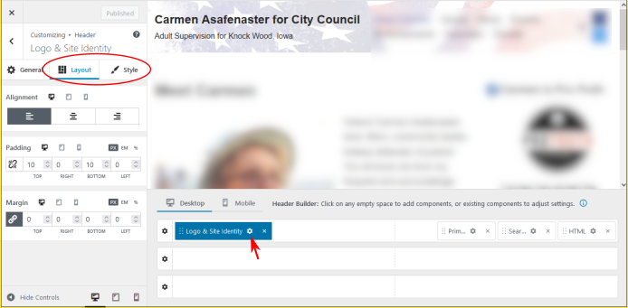
The term “mobile sidebar” in Neve is confusing. It refers not to the sidebar widget area, but to the popup that appears when you click the menu icon button. By default, this contains your site’s main menu, but you can put any of the usual header components into this popup instead of having them appear on the header. This is nice when designing the mobile behavior, a place to move things that appear on the desktop header but you don’t want taking up space at the top of a small screen.

In this screenshot, we’re still working on the header, but I clicked the “Mobile” tab rather than “Desktop”, so now I can work on the so-called mobile sidebar. I can put whichever header components I like onto it — the primary menu is there by default, and I added the “Button” component to give them more chances to donate to the campaign.
Fine-grained control of mobile experience
There are many places in Customize similar to the above, where you can separately control the appearance for desktop and mobile platforms (and in many cases, tablet can also be specified separately). You don’t have to make them different, but you can if you choose, optimizing the use of screen real estate when someone is on a smaller screen.
Flexible footer
Like the header, the website footer has three rows and several different components you can drag onto it, dividing it into columns if you like. These components are a “copyright” area whose contents you control, a footer menu, and up to four widget areas. Because widget areas can contain not just old-school widgets but any type of block, this gives lots of flexibility.

If you find this website helpful, subscribe for email updates!
Your information will not be shared (except with MailChimp, who manages the subscriber list).
Select which elements to display on posts and archives
Depending on the number of people writing posts on your website, the need for currency of the information, and personal taste, it’s nice to be able to control which elements of the post “metadata” appear in all archive pages and individual posts, and in what order. Neve lets you do this.
If all the site content is by you (for instance) you might choose not to display the post author. If it doesn’t matter how old your posts are because they are poems not news, you can hide the posted date. And so on.
Note: because of the recently added “query loop” block (and the availability of numerous post grid/list plugins), this ability is less needed for archive pages, because you can create lists of posts controlling the appearance fairly precisely. But I love it for individual post pages.
Named theme colors
It’s a good idea to limit the number of colors you use on your website. Neve has a palette of several named “theme colors” which you can select among wherever selecting a color. These colors have names like “dark background” and “secondary accent”, and you can control which colors those correspond to. This gives you a way to consistently apply a limited palette across your site, without having to keep a list of hex color codes off on the side.
Better yet, if you decide to change your site’s color scheme, you can change which colors correspond to each of these names, and it’ll apply to all the different places you’ve specified the color using those names. You don’t have to go hunting down occurrences of the old colors.
You still have the ability to enter an arbitrary color number at any point, instead of using the theme palette, but to simplify maintenance, try to avoid that.
Miscellaneous other things
There are many intelligently chosen options placed in Customize where one would intuitively expect to find them. I’ve repeatedly had the pleasant experience of thinking, “there should be a way to adjust that,” and it turns out there is, and it wasn’t hard to find.
Things that could be improved
While it’s generally excellent, the developers of Neve didn’t do everything right. I’ve included workarounds for the issues I discuss below.
Full width content needs a bit of margin
The layout choices include options for “contained”, where you specify the maximum width of the content in pixels, with a reasonable margin, and “full width”, which lets you use every bit of screen width. The problem is you generally want to have some sort of margin between the edge of the screen and your text, and you generally don’t want to have lines of text that go all the way across a very wide screen, because that’s hard to read. On the other hand, you sometimes do want to use the full width for a stripe of background color or cover image that goes all across the screen. So the full width feature, while useful, has to be used with care and tested on different size screens.
Header logo is too small
The maximum height of the website logo to appear in the header is 50px, which is too small in my opinion. Far too small for a website banner, for instance, with the site title included in the image so you can use fancy lettering instead of having it be regular characters.
To get around this, you can use the following CSS rule. Change the height number to the actual maximum height you want it to display (it will shrink if its container isn’t wide enough, as likely on a phone screen).
.site-logo img {
  height: 150px; /* or whatever height you need */
  aspect-ratio: 1;
  max-width: unset;
}
When you add the logo graphic (in Customize under Header > Logo & Site Identity) it can be whatever size you want. Skip the cropping step. If using the logo instead of text (i.e. the site name is part of the image), an image about 3 to 4 times as wide as it is high looks best on a header.
If you want a banner graphic, you have to make it the background of one of the header rows. This is a little tricky to set up, so I describe it in detail below.
Tagline too small
There’s a gadget you can drag into the header to control where (or whether) to display the site title, tagline, and logo. However, there’s no independent control of the font and size of the title and tagline, and the tagline is too small.
Often, you might rather use a graphic banner instead of this text, to have a fancy title in custom lettering with sparkles. However, if you like the look you get doing it the easy way and just want to make the tagline bigger, add this rule to your Additional CSS:
.nv-title-tagline-wrap small {
	font-size: var(--bodyFontSize)
}
This makes the tagline the same size as your default body text, which you can control in Customize and which, I hope, you’ve set to an easily legible size.
No custom excerpt on pages
This is a problem with many themes. When you write a post, you can always enter customized excerpt text to appear in archive pages and other post lists. This same ability is not available for pages, and it’s nice to have (for instance, to control how the page is listed in search results). To fix this, I wrote a “page excerpt” plugin.
How to put your site title on a banner graphic
If you want something more than plain text for your site title and tagline, you need to put them on a graphic and insert the graphic into the header as a banner. Because your header has three rows, you can dedicate a whole row to this banner and still have space for menus and other stuff above or below (or you can overlay other things onto the banner, like a search field or menu icon — your call).
There’s a straightforward way to do this, and fancier ways employing custom CSS rules. Let’s start with the easy way.
Example 1, easy way: lettering image overlaid on textured background
To avoid custom CSS rules but still have a fancy looking banner, you need two images — one with your site title/logo/whatever, employing transparency, and another to use as a background (or use a flat color or gradient, but that’s less fun).
insert the first image using the HTML header component. This is actually a little “Classic editor” that lets you add media, so you don’t have to write the HTML yourself.
Here are the two images for my example:


You can align the overlaid image however you like, and even use different alignments for mobile vs desktop. Just make sure the background image is such that you don’t care where the overlay appears in relation to it. Here’s the result for different devices.


Images in the HTML component get scaled down if they’re too wide for the available space, which is handy here because it should be smaller on a phone screen. Since the header can be configured differently for desktop vs mobile, I’ve taken advantage of that to also overlay the menu icon on the background if the screen is narrow (I had to change the icon’s styling to make it visible, since by default it’s black lines on transparency).
The main drawback to this approach is you don’t get to design the whole banner as an integral unit. The two parts can move or resize relative to each other. But this example shows you can add decorations around the important bits to make the “designed part” of the banner sparkle, and the less exciting background acts as filler when the screen gets really wide so you still have some visual interest on the rest of the banner. The other problem is, you only get one HTML header component (I believe the paid version has more). To get around that, you can add a CSS rule to remove the 50px height limitation on the logo image. Then use the Logo & Site Title component to do the above, freeing up the HTML component for other uses.
Unless you enjoy pain, this is how I recommend you do graphic headers in Neve. To design the entire header as a single graphic involves more custom CSS, tweaking positions of things, and worrying about background image center points. I’ll tell you how to do it. But I advise you stop reading now.
Are you still here?
I mean, it might be a nice lesson in CSS coding if that’s something you want to learn, but really, I’m just leaving this in here because I was stupid and did it the hard way before I figured out the easy way, and I hate for all that work to go to waste.
All right, you were warned.
The Less Easy Way
Again, we dedicate one of the three rows of the header to displaying your banner graphic (with maybe a menu icon or other little thing tucked in a corner). For this example I’ll assume you want to use Header Main, the middle row. If not, adjust accordingly.
In this example I’m using a single 1000x150px graphic with the words “The Wazz” centered on it.


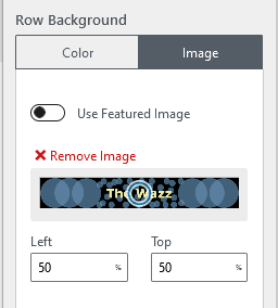
First use Customize to add the banner as the background to the header row, in Header > Header Main screen (or whichever row you’re using).
The row is only visible if there’s a header component in it. In the previous example that was the HTML component with the site title image. In this case you have to add a component you don’t otherwise need just to force the row to display, but it can be empty. If you’re not using the HTML or Secondary menu controls, drag one of them onto the row.
Now it’s a question of using Additional CSS rules to size and position the row so the banner displays the way you want it to at different sizes.
The default behavior of header background images in Neve is to exactly fill the available space without distortion — the aspect ratio (20:3 in this case) is preserved — but with cropping. If the header row doesn’t have the same aspect ratio as the image, part of the image is cropped to make it fit. For this image, if the height is less than 15% of the width, the top and bottom are cropped, and if the height is more than 15% of the width, the left and right are cropped.
Example 2a: No cropping
Let’s say regardless of screen width, you want the entire banner visible — no cropping and no whitespace showing around it. That means the row height has to be exactly 15% of its width.
Some custom CSS is needed for this, in the Additional CSS section of Customize.
div.header-main-inner {
  padding-top: 15%; /* change depending on image dimensions */
}
.header-main-inner div.container {
  position: absolute;
  /* contents must overlay the banner, not make it taller */
}
The padding in the first rule is based on a percentage of the width of the container, so top padding changes as the screen width changes, forcing the container to be taller. The second rule positions whatever empty element you put in to force the row to display, to overlap the padding rather than add to it. Even if it’s blank, it adds to the height.
Wait wait why this padding instead of using “vw” units?
The savvy CSS consumer at this point may be wondering why I’m messing with padding and absolute positioning rather than directly setting the height attribute using vw units, which let you specify a percentage of the screen width — 15vw in this case.
You could do that, but it’s not a general solution since in Neve theme, the header doesn’t have to be full width — it can be “contained” and have a max width and margins. 15vw would then be too tall.
Also, that doesn’t render accurately in Customize, because the vw units are based on the whole width of the screen including the Customize menu, not just the part occupied by the website preview.
Example 2b: No cropping, overlaying elements on banner
If the elements in the banner row are not empty, modify this CSS to position them in relation to their container, using the top, left, right, bottom, and transform attributes to set them where you want them. For instance, for mobile you might put the menu icon in the lower right corner of the banner.

You might need to experiment to get this right– in this case I fiddled with the size and background color of the menu icon, and changed the second CSS rule to:
.header-main-inner div.container {
  position: absolute;
  bottom: 5px;
  right: -5px;
}
Example 2c: Allow cropping left and right
It might be hard to design a banner that looks good when displayed at full screen width on every screen with no cropping. If the lettering on the image is tall enough to stand out on a phone screen, it might be ridiculously tall when displayed on a PC screen or anything else that’s wider than it is tall (such as the same phone turned sideways).
I designed the header graphic with that in mind. The important part — the site title — is centered, with “fluff” on the left and right that I don’t mind getting cropped. Now I want the header displayed at least 100px tall, and if that means we lose the left and right edges, so be it.
As noted above, the top and bottom will be cropped if the height is less than 15% of the width. To avoid that, we want a height of 15% or 100px, whichever is greater. Did you know you can do math in CSS rules?
div.header-main-inner {
  padding-top: max(15%, 100px);
}
.header-main-inner div.container {
  position: absolute;
}
Here’s the result on a narrow phone screen, and on a tablet which is wider.


To crop top and bottom instead, write a similar rule but with height a minimum of 15% and some constant.
Example 2d: crop on the right
To crop just one edge, change the image center in the Header > Header Main screen (or whichever header row you’re using if not Main). For instance, to crop only on the right, change the “left” setting from the default 50% to zero.

Of course, that’s not the best choice for this particular image.
Hey wait a minute! There’s a setting for the height of the header bar
Can’t I just set the height to an exact number?
Yes, you can. If you do that, the header will be the exact same height — in pixels — on all screens. Obviously it will not be the same width everywhere, so the aspect ratio varies, and something will get cropped. Some screens are really wide, and likely to get wider in the future, so you’d need an image with a lot of extra background on the sides. If your image ends up not being wide enough, the top and bottom get cropped, usually not what you want.
Also, the exact height that looks good on a desktop screen, generally is too big for a phone screen.
So, generally speaking, not a great option.
Hide the credit line in the footer
If you don’t want the footer of every page of your site to have a banner stating that you’re using the Neve theme, it is possible to hide this information. The only reasonably easy way I’ve found to do this, aside from paying for their “Pro” version, is to hide the entire “bottom footer” area. This still leaves you two other footer areas, which I’ve found to be sufficient.
If you want to take this route, in Customize go to the “Additional CSS” section and add the following rule:
/* Hide the Neve credit line (along with everything else in the Bottom Footer widget area). */
.footer-bottom { display:none }

