An Accordion control (aka Details) is an outline entry a visitor can click to expand and see its contents. This is built in to the WordPress Blocks editor, where it is called the Details block.
Try it out by clicking this heading
Congratulations! You have expanded the Details block!
Here’s another heading
Wow you are becoming an expert at expanding Details blocks.
There are also plugins that give this ability. The main advantage to using them is that they look prettier, but I haven’t seen one that offers enough more control over the appearance to make it worth adding another plugin just for that, at least for my own websites. Of course, I’m always happy to write a custom CSS rule to control appearance, whereas you might not be.
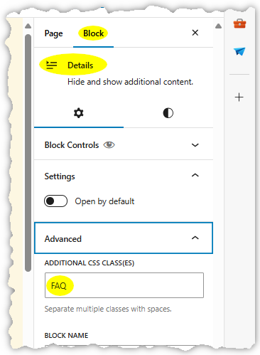
If you want to use this control and not have to write CSS, first try out the block’s built-in customization options and see whether you can satisfy yourself with those. If not, I offer below a few pre-written rules you can just copy and paste into your theme’s settings. To make use of these rules, you must use the “Additional CSS Class(es)” field of the block settings, as shown on the right.
You can name a style whatever you want, within reason. Start with a letter, and the rest of the name can be letters, digits, dash or underscore. I chose “FAQ” in this example.
You can enter custom CSS rules, which apply throughout your website, in the Customize screen of most themes. Look for a section under Customize titled, “Additional CSS” or something similar. Here’s a set of rules to give a more stylish look to the default appearance of the Details block:
details.FAQ { /* controls appearance of entire block */
  background-color: #00000012 !important;
  margin-bottom: 0.8em;
  border-left: 8px solid #c0c0c0;
  padding-left: 12px;
  padding-right: 10px;
}
details.FAQ summary { /* styling for header line */
  background-color: #00000080;
  color: white;
  padding-left: 12px;
  padding-right: 12px;
  font-size: 1.1em;
  margin-left: -12px; /* must match padding-left in previous rule */
  margin-right: -10px;
}
details[open].FAQ >summary { /* additional styling for header line when section is expanded */
    background: #000000c0;
    margin-bottom: 10px;
}
Example of above styling
The semitransparent backgrounds for the header and contents darken whatever background the site already has. You can change those color codes to opaque colors, or use other CSS rules to choose an image background (for instance).
When editing the page…
You won’t see this custom styling during editing. I like to set the background color of the Details block, just to make it clearer for myself what content is inside the Details block (click the half-black, half-white circle shown in the above screenshot to find that setting). The color in the CSS rule will override that.
What if you have details nested in other details?
Why, then it looks like this.
If you choose a name other than FAQ, substitute that name for FAQ in the above rules. Tweak these margins and colors to suit yourself — experiment!
If you find this website helpful, subscribe for email updates!
Your information will not be shared (except with MailChimp, who manages the subscriber list).